Executive Overview Dashboard
Comprehensive year-over-year business performance analysis

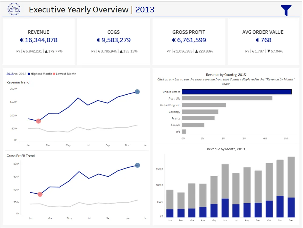
Dashboard Preview
Business Value
This dashboard enables executives to:
- Monitor KPIs - Track revenue, costs, profit, and order metrics in real-time
- Identify Trends - Visualize performance patterns across time periods
- Compare Performance - Analyze year-over-year growth and decline
- Geographic Analysis - Understand market performance by country
- Data-Driven Decisions - Access key metrics without manual report generation
Key Features
1. Year-over-Year Comparison
- Dynamic year selection via parameter
- Side-by-side comparison of current year (CY) vs. previous year (PY)
- Automatic calculation of growth percentages
- Visual indicators for performance trends (highest/lowest months highlighted)
2. Financial KPIs Dashboard
Four critical business metrics displayed prominently:
- Revenue: Total sales amount with PY comparison
- COGS (Cost of Goods Sold): Total product costs
- Gross Profit: Revenue minus COGS
- Average Order Value: Revenue per transaction
Each KPI shows:
- Current year value
- Previous year value
- Absolute change
- Percentage growth (with directional indicators)
3. Interactive Proportional Brushing with Set Actions
What is Proportional Brushing?
Proportional brushing is an advanced interactive technique that allows users to explore relationships between different data dimensions while maintaining visual context.
How It Works:
- Click on any bar in the “Revenue by Country” chart
- The “Revenue by Month” chart automatically updates to show:
- Blue stacked bars: Revenue from the selected country
- Gray stacked bars: Revenue from all other countries
- Proportional comparison: Users can immediately see how the selected country contributes to monthly revenue alongside other countries
Technical Implementation:
- Country Set created as a dimension-based set
- Set Action captures user clicks on the Country chart and updates the set
- Color shelf uses the set to differentiate selected (blue) vs. unselected (gray) countries
- Highlight Action with dummy calculation disables Tableau’s default highlighting behavior
- Automatic stacking shows proportional contribution in the Revenue by Month chart
Business Impact:
- Executives can drill down into specific markets without losing sight of overall performance
- Immediate understanding of market contribution to total revenue
- Part-to-whole analysis at a glance
- Enhanced decision-making through contextual data exploration
4. Trend Analysis
- Revenue Trend Line: Monthly revenue progression with trend indicators
- Gross Profit Trend Line: Profitability tracking over time
- Comparative Lines: Current year vs. previous year overlays
- Seasonal Patterns: Identify peak and low-performance periods
5. Geographic Revenue Distribution
- Horizontal bar chart ranking countries by revenue contribution
- Interactive selection for proportional brushing
- Clear visual hierarchy of market importance
6. Monthly Performance Breakdown
- Stacked bar chart showing revenue composition by country
- Month-by-month performance tracking
- Easy identification of seasonal trends and anomalies
Project Context
This Tableau dashboard is the visualization layer of a comprehensive data engineering and analytics project:
Project Ecosystem
┌─────────────────────────────────────────────────────────────┐
│  1. SQL Data Warehouse Project                              │
│     └─ Bronze → Silver → Gold Layer Architecture            │
│     └─ Star Schema (Fact & Dimension Tables)                │
│                                                             │
│  2. SQL Data Analyst Project                                │
│     └─ Advanced Analytics: Trends, Cohorts, Segmentation    │
│     └─ SQL Views for Reporting                              │
│                                                             │
│  3. Tableau Executive Overview Dashboard (This Project)     │
│     └─ Interactive Visualizations                           │
│     └─ Business Intelligence Layer                          │
└─────────────────────────────────────────────────────────────┘
Related Projects
-
- Data ingestion and transformation (Bronze → Silver → Gold)
- Star schema dimensional modeling
- Data quality and cleansing
-
- Advanced analytics queries
- Time-series analysis, cumulative calculations
- Customer and product segmentation
This dashboard connects directly to the Gold layer views created in the data warehouse project, ensuring data consistency and reliability.
Dashboard Components
Data Sources
The dashboard connects to three optimized data sources from the SQL Server data warehouse:
gold.fact_sales- Transaction-level sales datagold.dim_customers- Customer dimension with demographicsgold.dim_products- Product dimension with category hierarchy
Calculated Fields
Financial Metrics:
Revenue CY = SUM(IF YEAR([order_date]) = [Select Year] THEN [sales_amount] END)
COGS CY = SUM(IF YEAR([order_date]) = [Select Year] THEN [quantity] * [cost] END)
Gross Profit CY = [Revenue CY] - [COGS CY]
Profit Margin % CY = [Gross Profit CY] / [Revenue CY]
AOV CY = [Revenue CY] / COUNTD(IF YEAR([order_date]) = [Select Year] THEN [order_number] END)
Year-over-Year Comparisons:
Revenue PY = SUM(IF YEAR([order_date]) = [Select Year] - 1 THEN [sales_amount] END)
Revenue Growth % = ([Revenue CY] - [Revenue PY]) / [Revenue PY]
Proportional Brushing Implementation:
- Country Set: Created from Country dimension (right-click → Create → Set)
- Set Action: Updates Country Set when user clicks on Revenue by Country chart
- Dehighlight Calculation:
'Dummy'- Used to disable default Tableau highlighting - Color Application: Country Set placed on Color shelf in both charts
Usage
Interacting with the Dashboard
Year Selection:
- Use the Select Year parameter dropdown to switch between available years
- All KPIs and charts update automatically
Country Selection (Proportional Brushing):
- Click on any country bar in “Revenue by Country, 2013” chart
- Observe how “Revenue by Month, 2013” shows:
- Blue bars = Selected country revenue
- Gray bars = Total revenue (all countries)
- Click elsewhere to deselect and return to full view
Trend Analysis:
- Hover over trend line points to see exact values
- Colored circles indicate highest (blue) and lowest (red) performing months
Key Insights Delivered
This dashboard answers critical business questions:
How did we perform this year compared to last year?
- Immediate visibility of YoY growth across all KPIs
Which markets drive our revenue?
- Country-level revenue contribution and ranking
What are our seasonal trends?
- Monthly performance patterns and peak periods
Is our profitability improving?
- Gross profit trends and margin analysis
How does a specific market perform relative to total business?
- Proportional brushing reveals market contribution context
Acknowledgments
- Data sourced from simulated bicycle retail sales (ERP and CRM systems)
- Dashboard design follows industry best practices for executive reporting
- Proportional brushing technique inspired by visual analytics research